


At the core of the identity lives the Hershey Fonts. A.V. Hershey, their creator, was a theoretical physicist who programmed instructions that plotted vectors into the shape of letters to use in his publication and computational work in the late 1960s.
Strategy
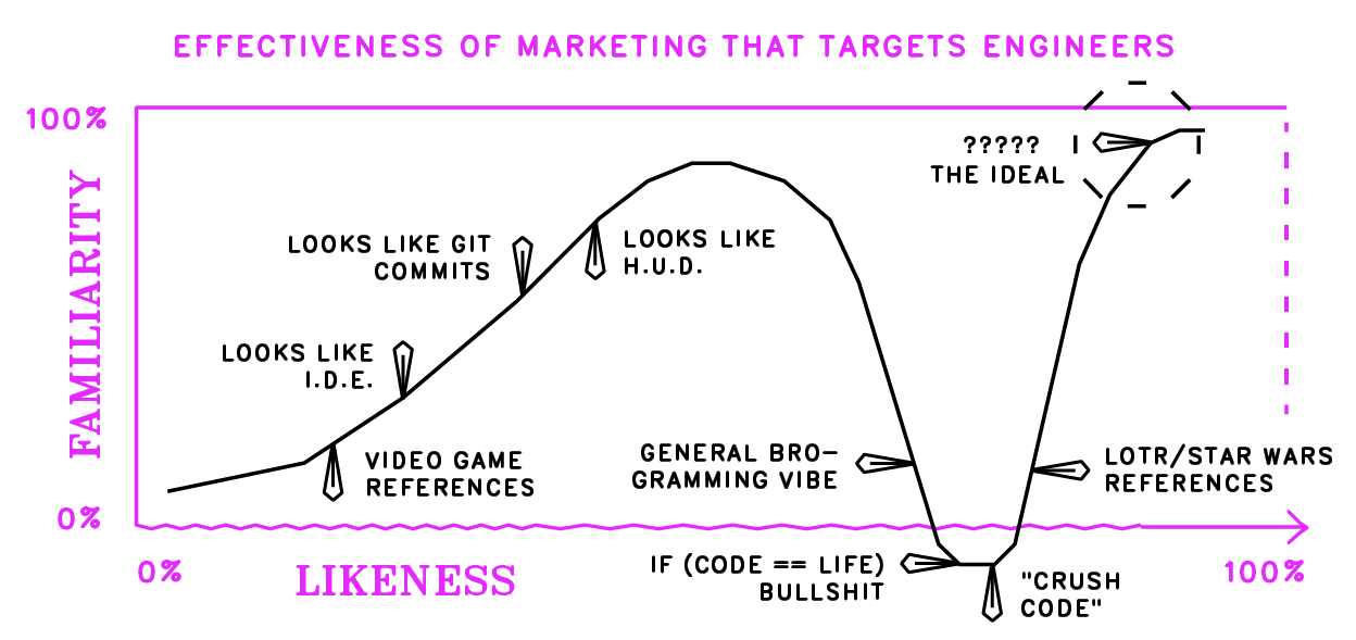
My early explorations were overly-reliant on geek nostalgia. The nerdy engineer is a tired cliché at this point and it’s a challenge to convince a smart audience that your efforts to target them are backed with sincere intentions.
Typography
The Hershey fonts were a godsend. They were effortlessly nerdy. So I bundled together some .SVG files lying around the internet, and created a set of workable typefaces.

Building on Typography
The Hershey fonts did all the heavy lifting. The 1960s computer vector ideas built into the type informed the colors, patterns, icons, and animations.

Call to Action...s
Easter eggs, custom cursors and interactions antagonized the user to view the source, delete elements, click and drag to customize. The CTA cloned itself at a random position until it overwhelmed the entire site.
Icons
The kit was rounded out with a set of icons to match the vector style of the Hershey fonts.