


Art Direction and Photography
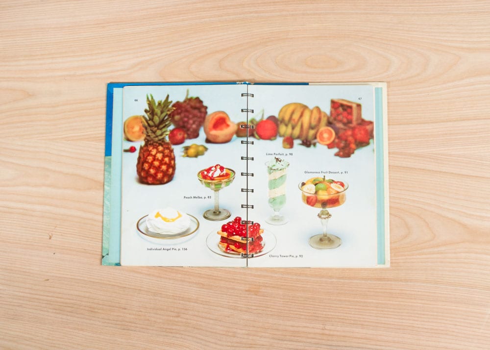
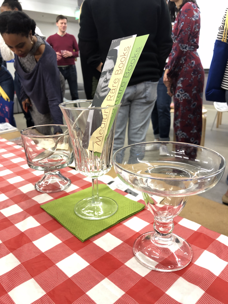
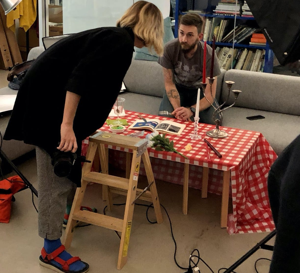
We tried using each book's unique ISBN and the OpenLibrary API to populate the cover image for our database, but very few of our books had ISBNs, and the ones that did were so rare that no scan of the cover existed. Kelly painstakingly scouted some props and she and Matt got to the task of shooting the 200+ covers with two interior shots each.
Headline Type
With a database of books, type was our most predominant design element. So I drew a custom typeface (Medium Rare Sans): a bizarre sans bolted onto a vanilla genre. Unusual proportions, overbites (see a), underbites (see g), flat bottomed t's and y's, and diamond dots all contribute to that feel.

Caption Type
The system needed something that could get small. Teaming up with Messer for body text, Medium Rare Caption became the bedrock of ignorable copy.

Icons
Behind the scenes, our yml database file was tracking 9 data points, but most were less than interesting to display. I drew a set of icons to support and add intrigue.