


Updated Logo
Mona's head got a little more circular, less boxy. The vectors transition better, are less tense overall. A subtle curve inflection and slightly bigger arm support a more tentacle-like feeling creates better overall symmetry.
Old (2015-2025)
New (2026+)
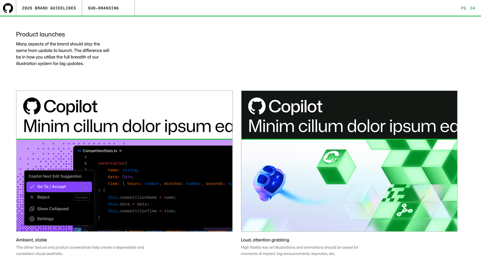
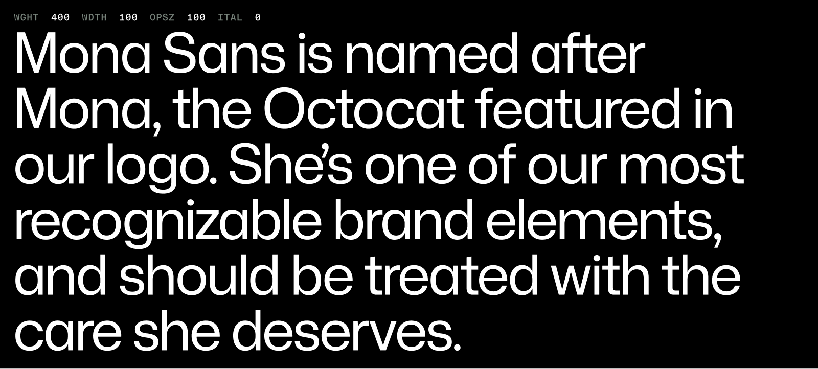
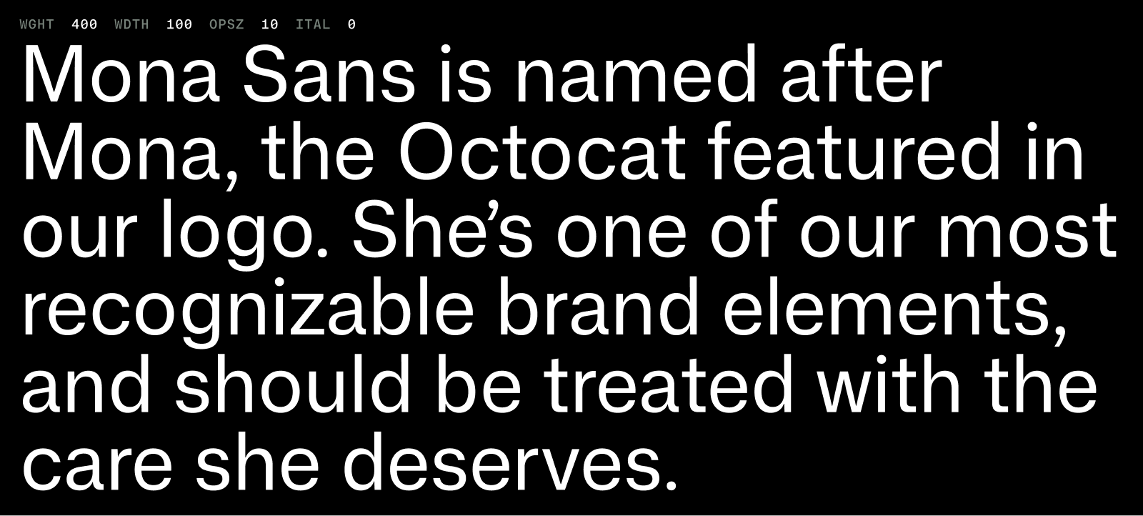
Expanding Mona Sans
I added optical sizes and monospace styles to Mona Sans' already large design space. This allowed me to redraw and space characters to suit their size.
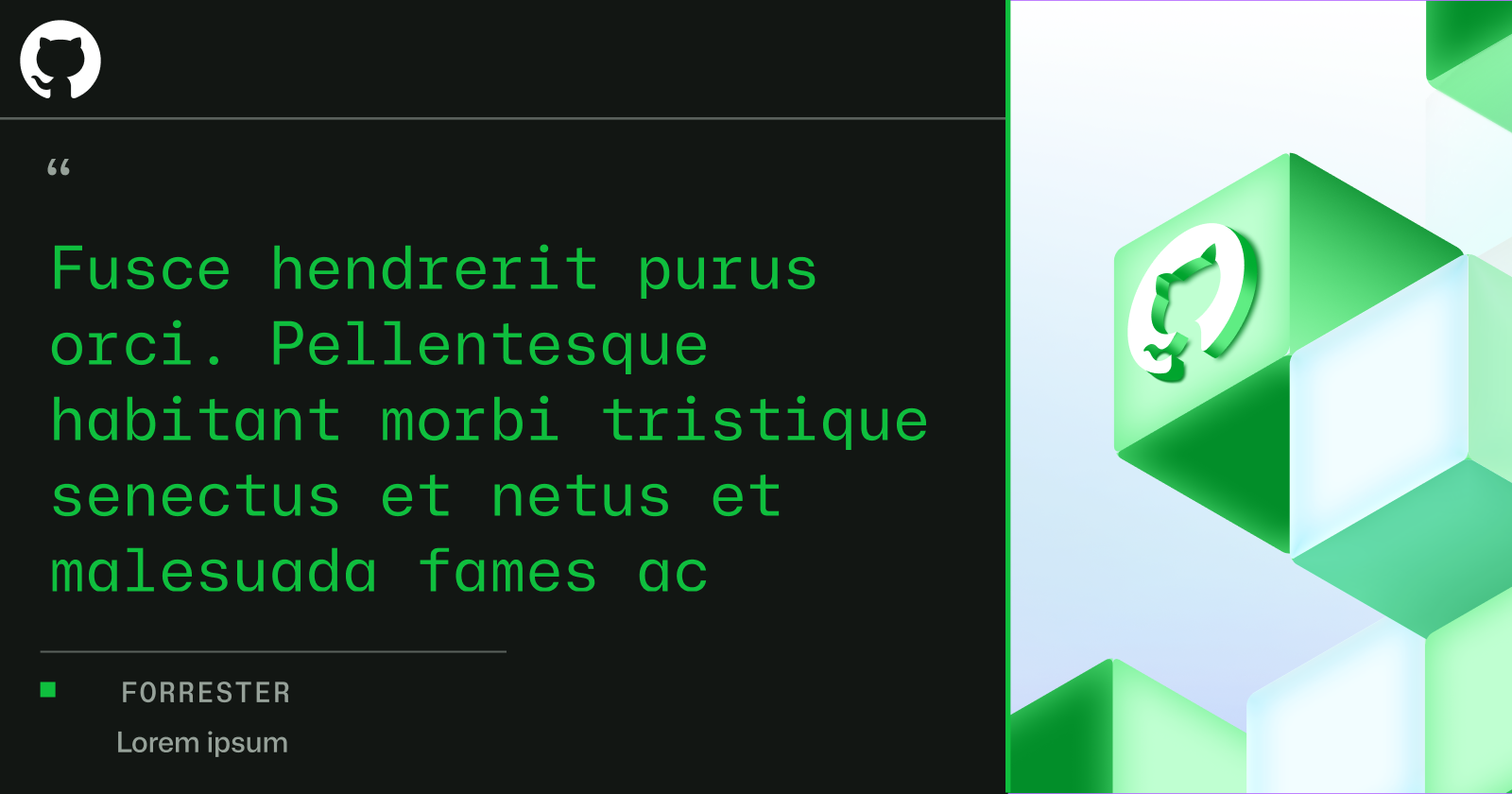
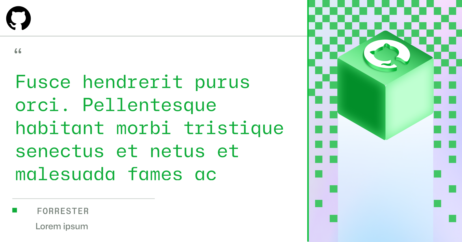
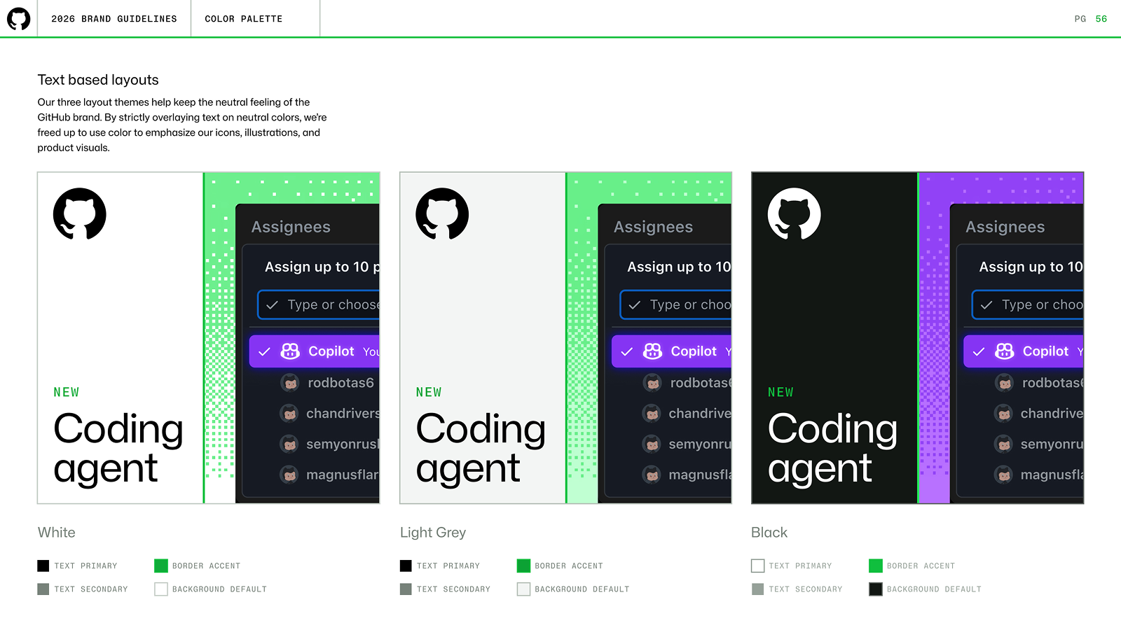
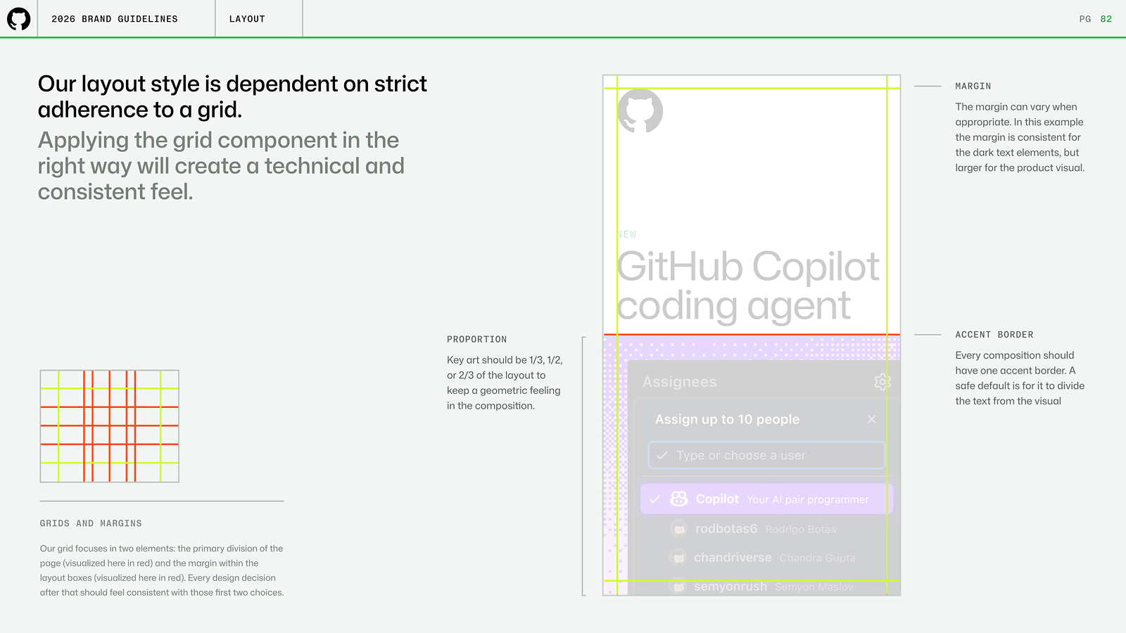
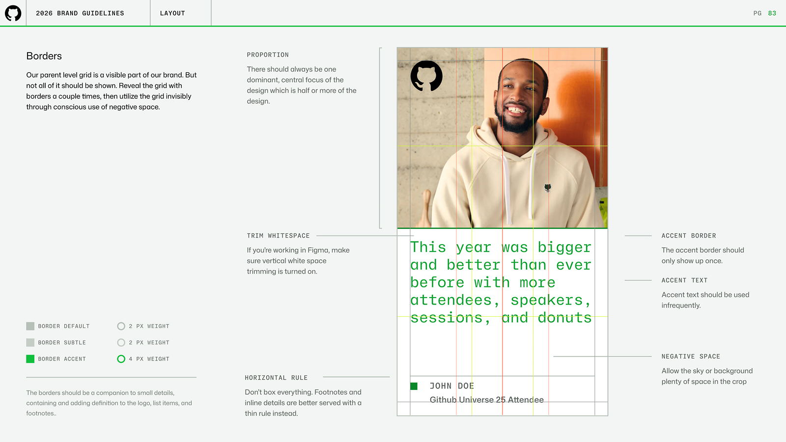
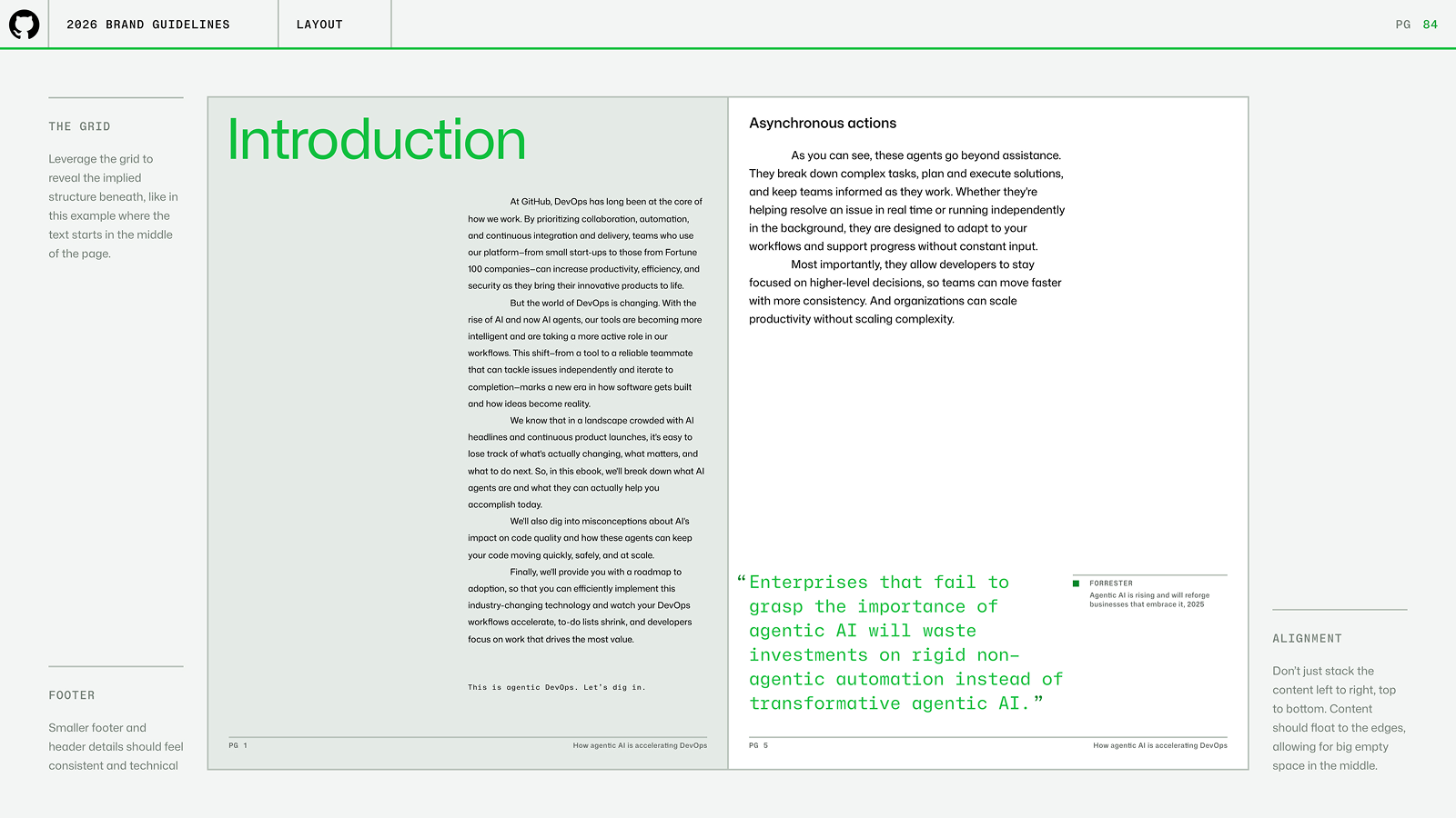
Layout system
The layout system split visuals into clean halfs or thirds. Each side represented the two parts of GitHub's offering: creative, infrastructure. The layout side was legible, grided, seperate. The illustration side was creative, dimensional, expressive.