Webflow Rebrand

2023

Webflow just turned ten. Its style was beginning to lag behind the competition. In an effort to catch up, the internal team put together a two month sprint to refresh the look of the brand and product design. The work was expanded and implemented by every designer at Webflow, the team listed here is just that core sprint group.

Me, Kyle
Me, Kyle
Design
Sara Lundberg
Sara Lundberg
Design
Corey Moen
Corey Moen
Design
Meg Wayne
Meg Wayne
Design
Rese Wynn
Rese Wynn
Design
Jason Combs
Jason Combs
Design
Pat Szot
Pat Szot
Design
Huseyin Gayiran
Huseyin Gayiran
Product Design
Sergie Magdalin
Sergie Magdalin
Product Design
Mackenzie Child
Mackenzie Child
Product Design
McGuire Brannon
McGuire Brannon
Direction

Display

Text

Icons
Marketing icons were our best plug and play asset. They showed up across slides and site, so they needed to feel consistent and branded.
Icons Icons hover state
Icon Manager
At the end of the project, I built an Icon Manager which could connect product, marketing, and self serve. It also allowed us to deploy updates.
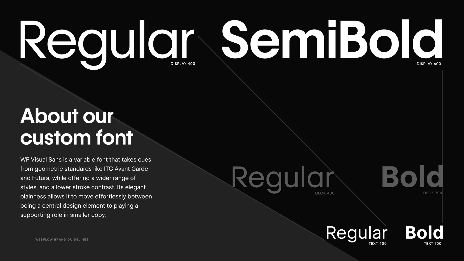
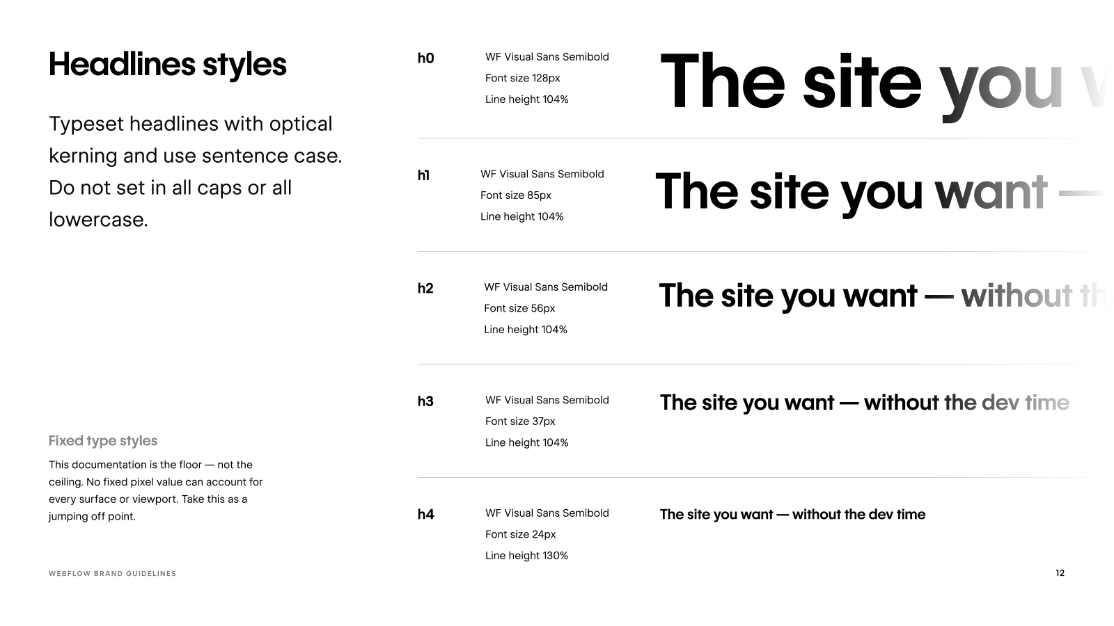
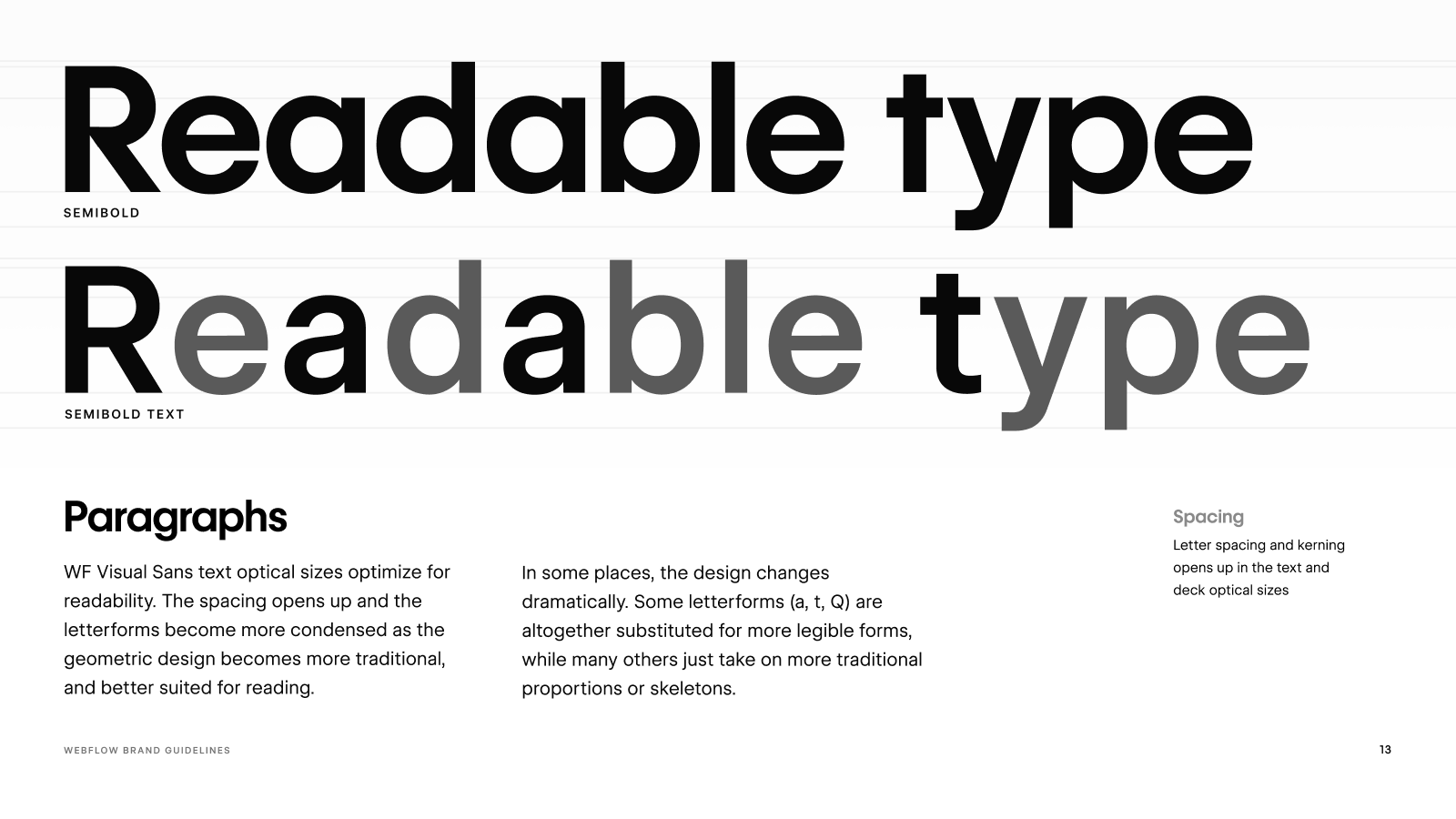
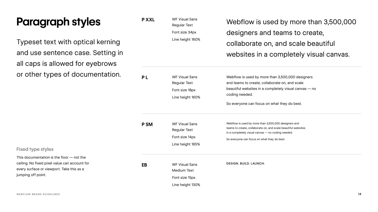
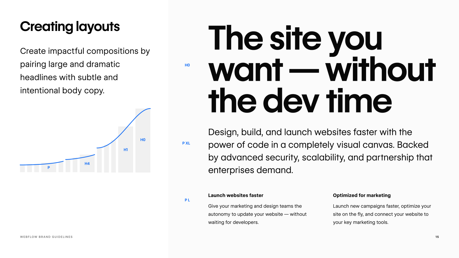
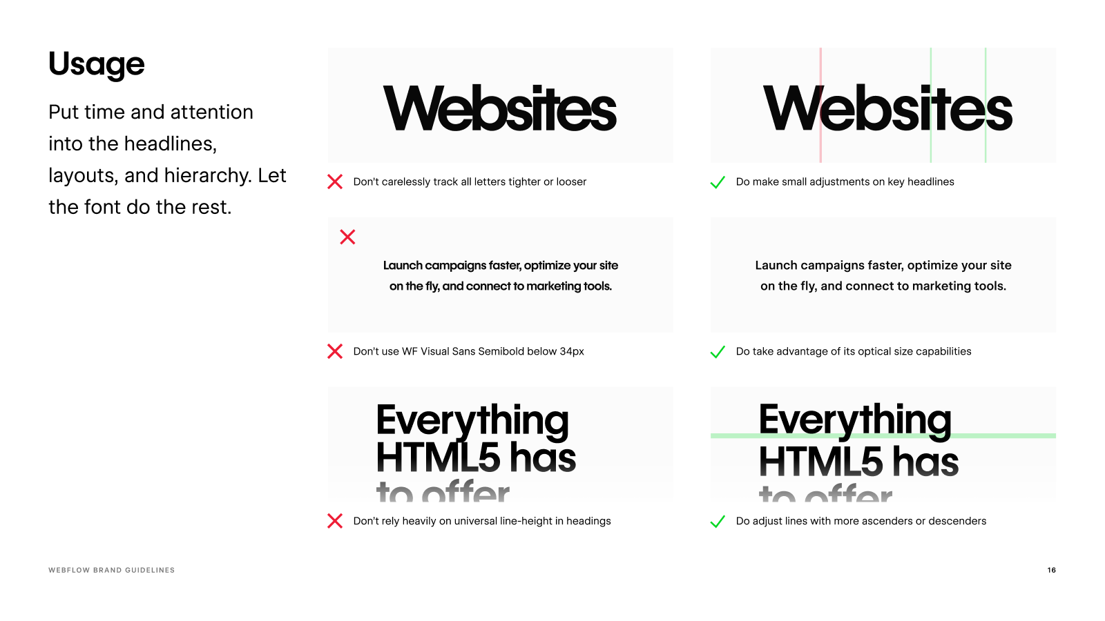
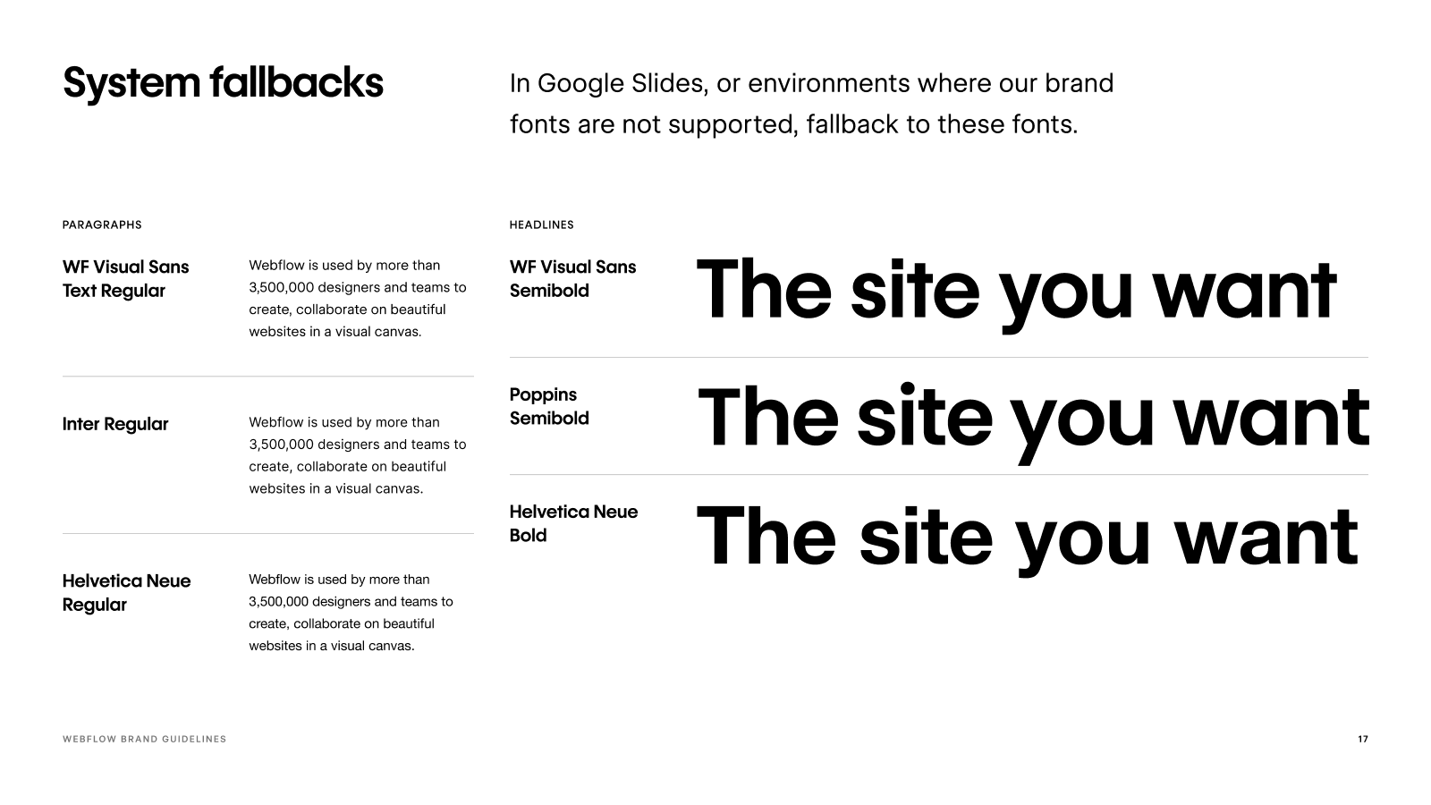
Typography
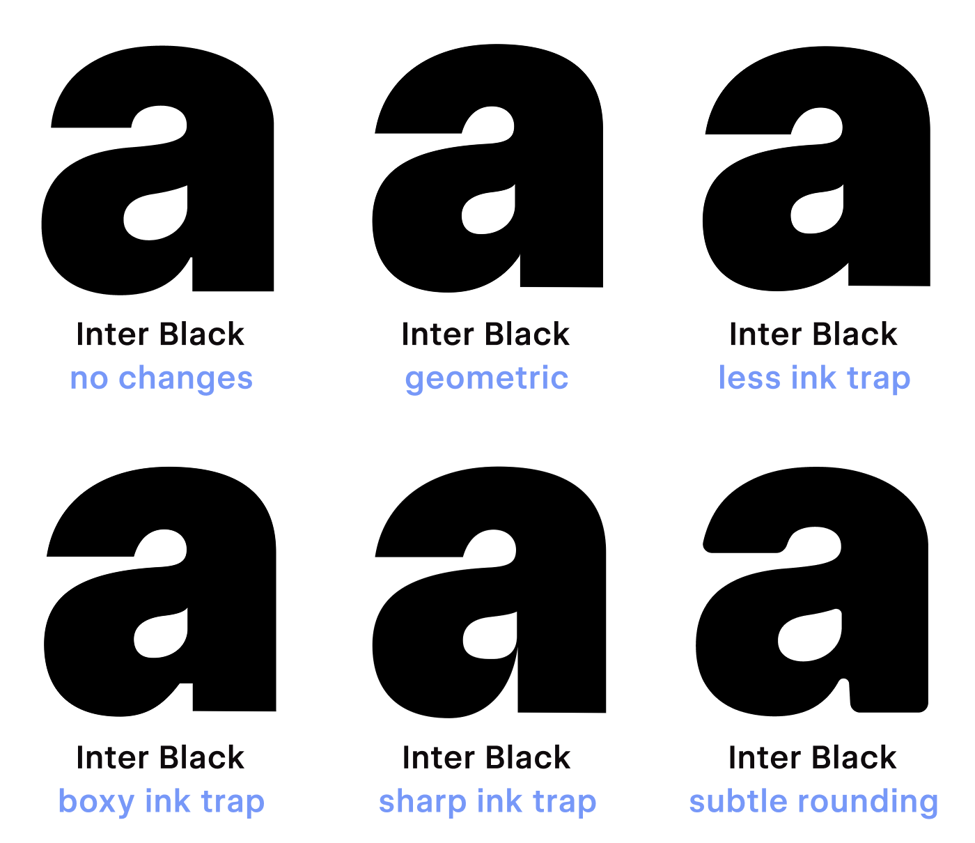
In order to connect brand and product, the custom typeface needed to functionally span display, text and ui. Inter, the product typeface, proved a good start for exploring sketches.
Typography
Monospace
A few years after the rebrand launched, I expanded the family into a set of Mono and Semimono styles. The set followed pretty standard width conventions, but was meant for marketing and display.
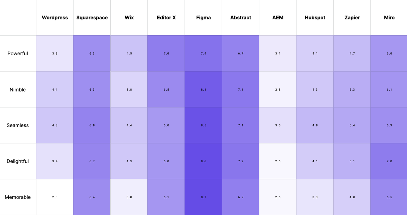
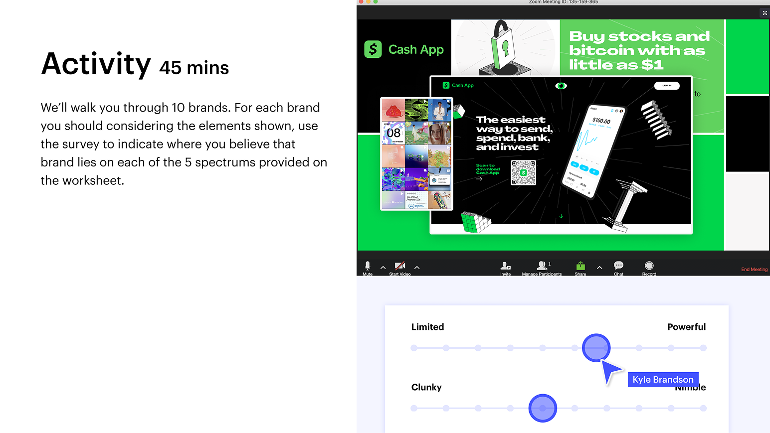
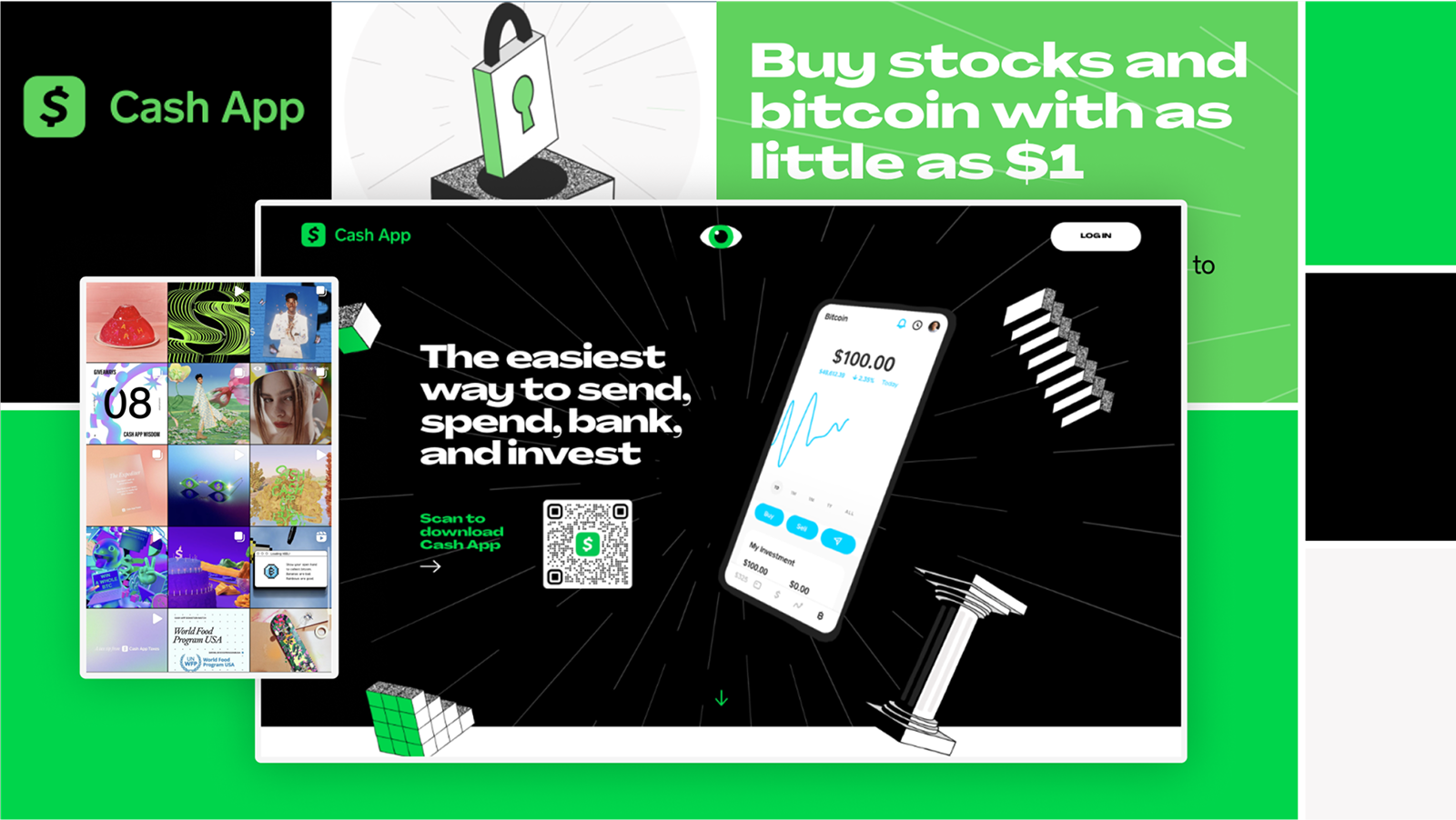
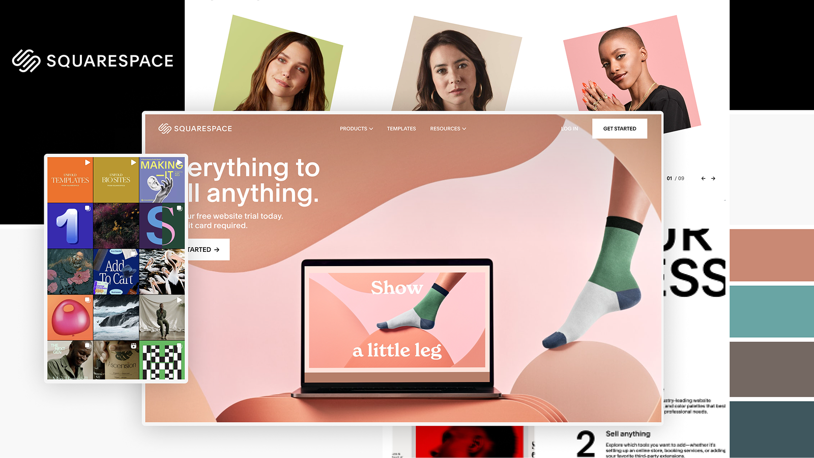
Monospace
Research Activity
In the research phase, Pat and I put together an activity to help understand what Webflow leaders and designers wanted. This pulled together moodboards from competitors, and asked visually-minded stakeholders to provide feedback.
Research Activity
Results
The results of the activity showed a shared admiration for brands with end to end cohesion, and design systems that felt more like a design language.
Results
Kyle W. Benson
Kyle Wayne Benson

I’m a brand designer in Oakland, CA. If I'm not baking or reading, you’ll find me at Savers. I run Very Cool Studio, work as a brand designer at GitHub, and run Song Club Records.

In my experience, design is what it does. Designers (me, Kyle) have the tendency to fall in love with the conveyor belt. And as we all fall in love with the clean doingness of AI, it has become more and more important to ask “okay but what does it do.” Design is the opinion-making process for answering that question. I sorta think this is what trust the process means. At the start of every project I’m a little dumb—at the end I’ll be a little smarter. If I’m doing my job right, the work will be a little more than me—kinder, smarter, more true to its purpose—leaving me in my state of stupor for the next project.

And maybe because I see myself as a little dumb, I think of most design problems as interpersonal problems. I still haven’t found a good enough idea, a plan so god-tier that it’s self-convincing. And the subjectivities that get in the way of those smart plans are only a problem because we say so.

If you made it this far, let's talk — that's the interpersonal part.

Category Link
Social Very Cool Studio Instagram Bluesky Substack
Colophon Font is VC Nudge SemiNormal Hosted on GitHub Pages Built on Jekyll with tailwind
Contact hello@verycoolstudio.com